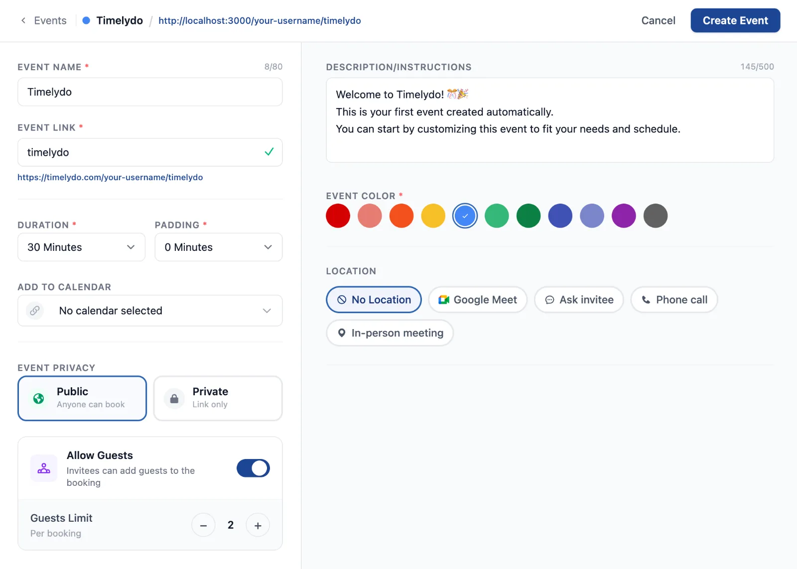
One screen, not a form to wade through
Everything that makes an event now sits on a single screen at Create Event Page. The essentials stay on the left, the detail sits on the right, and neither scrolls away from the other. The Save button stays greyed out until the event is genuinely ready, so you are never guessing whether you missed something.
The header follows along as you work. Your event name, its colour and the exact link people will book through are all visible while you type them.
Choose the calendar it lands on
The calendar field is a search box now. Start typing and it filters as you go, so picking the right one takes a second even when you have a long list connected.
Pick how you actually meet
Location is five clear choices rather than a menu to guess at, and each one opens only the settings it needs.
It works on a phone
The builder was laid out again for small screens rather than squeezed into them. Every option above is there, stacked in the order you need it.
Where to find it
Every event you have made is listed at Events Page, and a new one starts at Create Event Page. Both links need you to be signed in.